Firedog Revisited
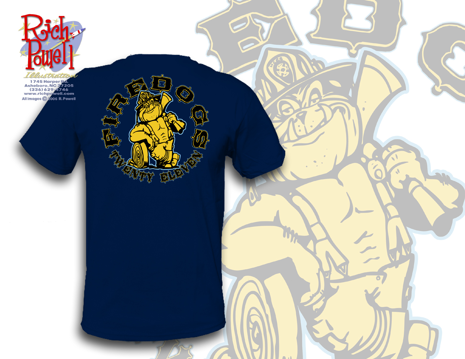
As you saw in an earlier post, I was working on a t-shirt design for a graduating class of firefighters. I’ve inked it and colored it and sent it in for client review. T-shirt design can be tough due to the limited number of colors you’ve got at your disposal. I like to use spot colors as opposed to process (cmyk) in which you end up with a ton of teeny dots blending to make up a myriad of colors. Process can look good but due to the size of the screen it always looks a little grainy to me. Spot colors are vibrant and crisp. The color of the shirt is a big factor as well. A dark shirt may need a base flood coat of white to make the other colors shine.
This client was willing to pay for a 4 color shirt but I thought I’d try to save him a little dough and show him a 3 color approach to begin with.
This way, the addition of a white flood coat is still an option.
From this point, if it’s approved, I’ll need to create the file in a vector program such as Adobe Illustrator. This can be a real drag and really isn’t necessary (all the shirts I do for Crazy Shirts are done at 300 dpi in Photoshop) but many printers insist on a vector design. Ugh.


I agree Rich, as an ex silkscreen printer a solid three color job is much appreciated over four color seps and registration headaches (not to mention a usually worse looking product).
Also you could make all of the light-blue solid, print it first, and it would be enough of a flood coat to make the yellow “pop” the same way a white flood coat would.
Thanks!