In the MAD house!
I thought I’d give you a look at what a typical job for MAD Magazine is like. Creating MAD Magazine art was initially a very intimidating thing but after a while, working with the lovely (and calming) Nadina Simon and good ol’ Patty Dwyer led to me feeling confident and comfortable! Sam Viviano was a great art director and knew exactly what he was after, so it usually took me a few steps to get there. I was always surprised that I had to tone stuff down for MAD. I thought “Finally! Let her rip!” and drew some pretty disgusting stuff initially.
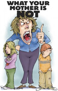
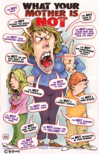
This job was for MAD #463 and was a poster, written by Dennis Snee and titled “What Your Mother is NOT”, perfect for any kid’s room . Nadina described the setup to me as a huge, imposing mother figure railing at her boy and girl about all the things she is “not”. I figured, okay, if you want a kid to put a poster with your mom spouting a bunch of rules up, let’s make Mom horrid and funny to look at .
This i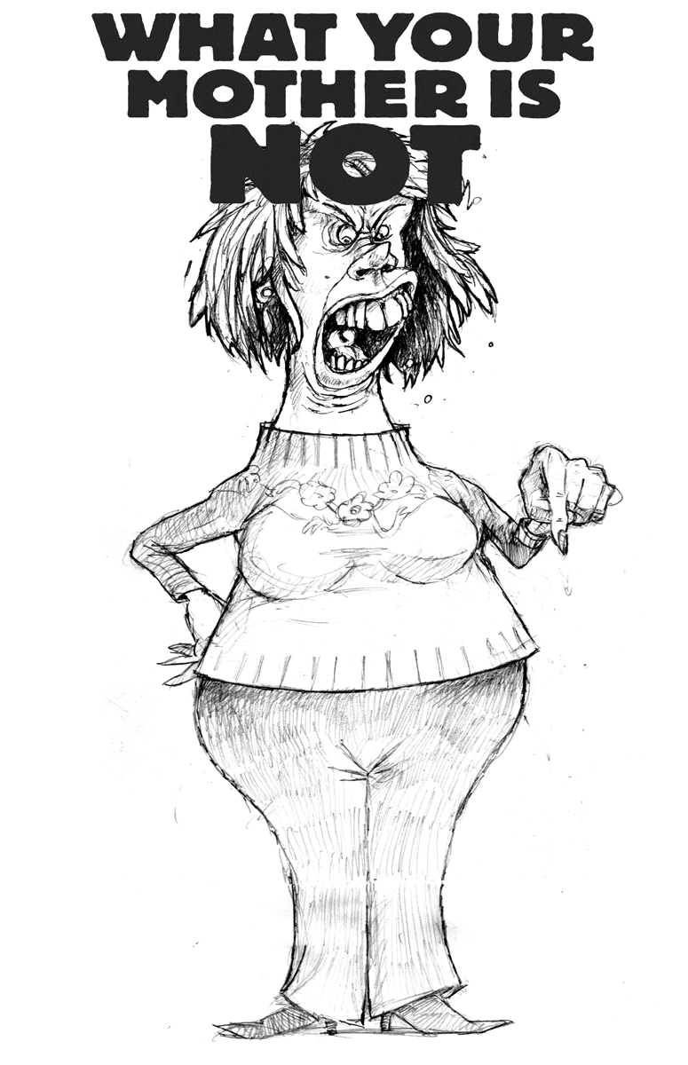 s my initial attempt. Looking at it now, I can see that , yeah. it’s a little over the top on the ugly side. She looks like some Mister Ed, horse-faced freak who just escaped from some circus of insanity. Yechhh. Her body language is also really stiff. I hadn’t drawn the kids yet.
The art direction was “Too ugly, too stiff. Make her look more human and really add some action to the figure” or something like that.
My next version was a complete redraw (often I would simply overlay elements in Photoshop) and I tried hard to add some flying spittle and flailing limbs. I also added the kids in the composite before sending it in.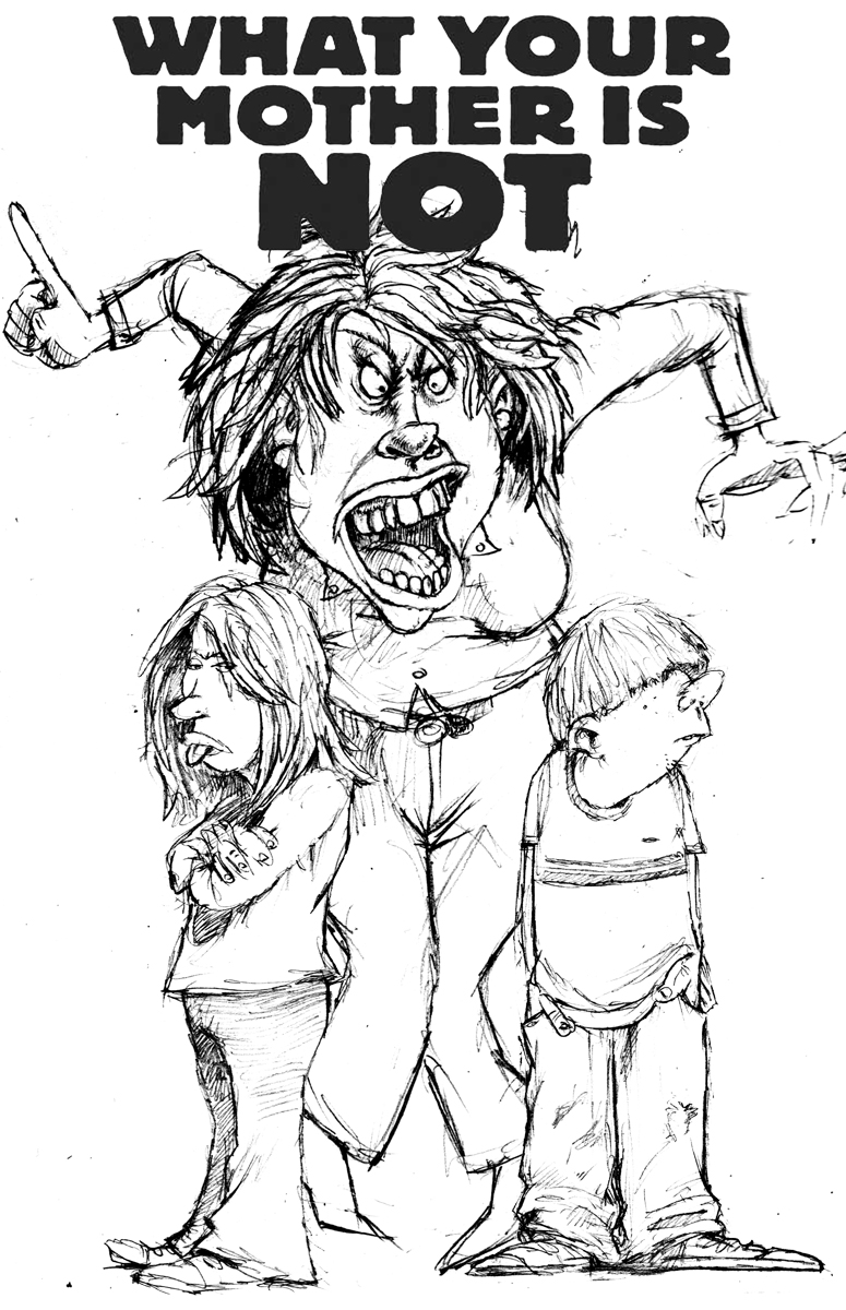
Okay, she still looks like a friggin’ lunatic. That mouth. Looking at it now, I think the hair is too dead for this pose and I’d like to see one of her feet off of the floor.
No matter. The art direction was to tone the face down again and pull back on the animated limbs. The kids can stay.
So It’s back to the drawing board and Photoshop. Here’s the new version. Mom is more “attractive” less crazy looking, perhaps. More “soccer-mommish” I’d say.
The kids are more separated and you can see her legs a bit better. I like the open mouth and the fact that you can see the whole uvula set up back there. Adds a little depth.
At this point I don’t like the kids anymore but…they’ve been approved and I ain’t the art director. Now, it’s into photoshop for the color.
I work at 300dpi at print size and try to draw the original a little larger than what you’ll see in the magazine. It’s hard to do that though, with these teeny-ass scanners these days. I have to scan the art in pieces and place them on separate layers, lining them up before flattening. I usually scan a good overlap on each section and line them up on layers above the initial scan by turning the transparency up a bit. Once it’s line up by nudging and rotating in small degrees, I’ll use a soft-edged eraser tool to remove the hard edge of the overlap.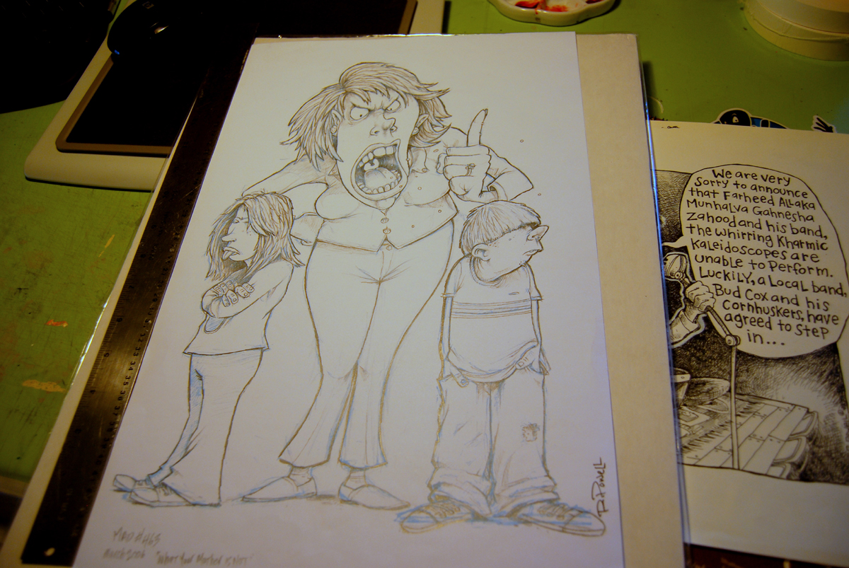
Here’s the drawing at full size. That’s an 18 inch ruler on the left hand side to give you scale.
his one ended up being drawn at actual printing size so I had to work very clean. It’s funny, the first job I did for MAD, I automatically inked, thinking that was the way it was done, only to be tod that “No! We like the rough/clean look of your pencil work!” and from then on, I had to walk a fine line between rough and clean. It was almost harder than inking!
Here’s the progression from the final pencil, through color to the final, printed piece sent to me as a tearsheet and scanned.
Madly-
Rich


Interesting synopsis of the Mad-ness getting your work published…but since they obviously know what they want, then you can only say…”In MAD we trust”…
RD
LOVE the smiley face earrings!