Turkey Puck
My old friend Tommy recently called me about creating a shirt for a new Hockey Tournament he’s putting together up in New Hampshire. He’s really into hockey and I’ve done other work for him in the past, it’s always fun. Tom has a good eye and a great sense of humor. I’m always trying to sneak a black eye and a missing tooth into these things…that’s the way hockey players were always portrayed in MAD, right? The thing is, Tom is a dentist. Ironic?…or looking for new patients?
This tournament is taking place on Thanksgiving weekend this year so Tom thought a turnkey in a hockey suit might be appropriate. This may be a first in the sport, or any sport for that matter. Who would choose a Turkey as a mascot???
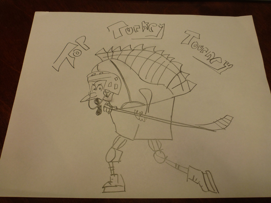
The nice thing about working for Tom is that he’s not too shy to try to show me what he’s after. A lot of folks would never attempt this. Pride is a disabling thing! Here’s the sketch he sent along:
You wouldn’t believe how much something like this helps. I try to knock these type of things out fast so I can keep the cost down and this really gives me a starting point.
SO, The first thing I did was google Turkey and Hockey Player of course. I want to be fairly accurate with the equipment and I’m used to seeing turkeys on their back, naked and headless. It’s nice to have the internet, back in the day each artist would have a Morgue: a huge collection of photos of everyday things. Need to draw a telephone pole? Check the morgue. You’d be surprised at the little things you’d forget that make a telephone pole uniquely telephone poley!
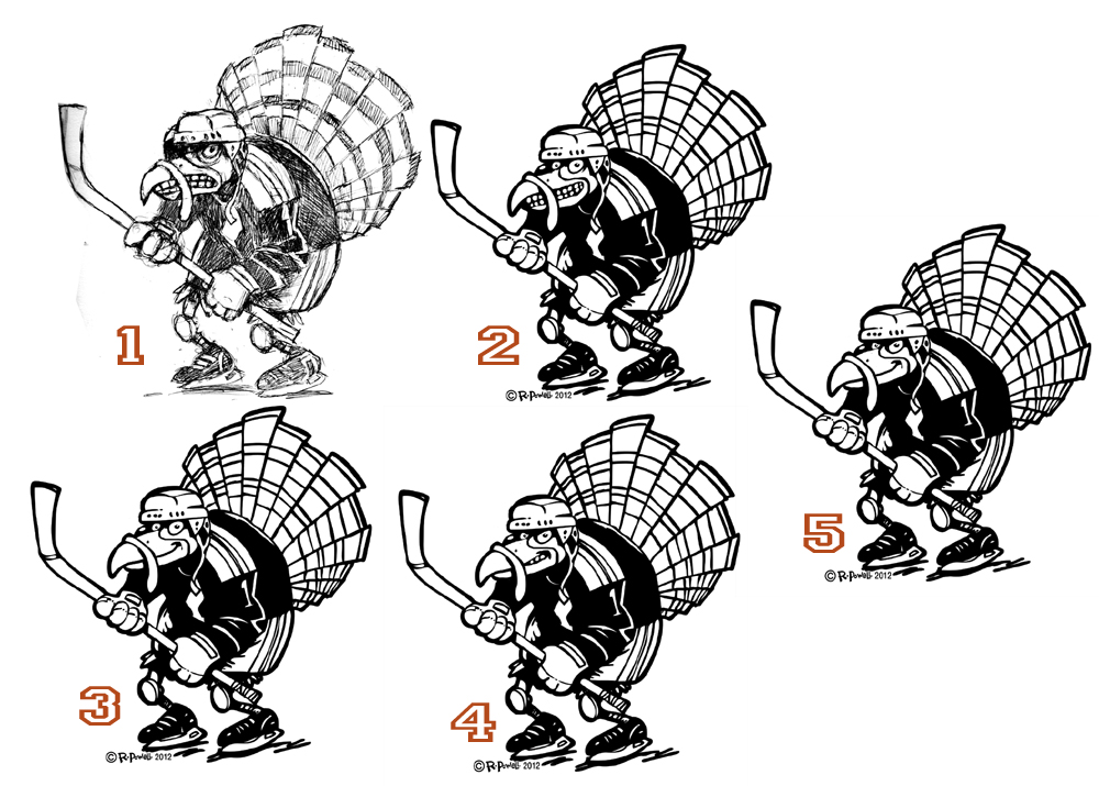
Next I hit the sketchbook and had fun with it. The initial guy looked pretty insane though. Tom requested I tone it down a bit (wussy!) and we went back and forth until we found the right mix to give him a more “sly” look”. Here’s the progression:
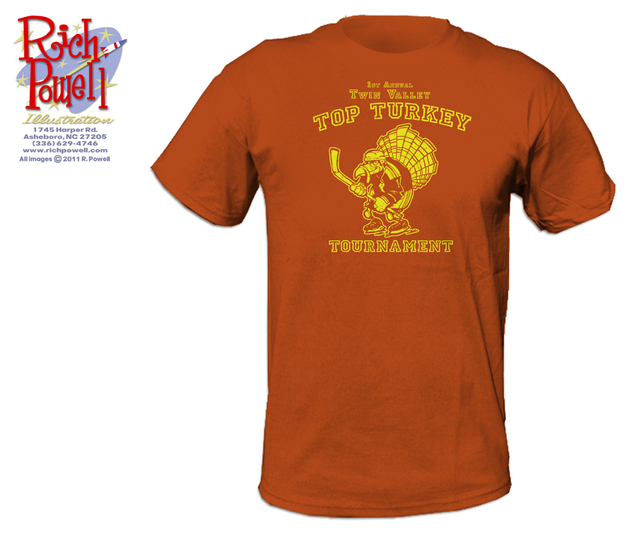
I like the final guy a lot better than the first. Next I mock up a shirt so we can decide on shirt/ink colors.
Here’s a close-up of the design. I wanted to add some “distressing” and had to show it to Tom fairly large to give him an idea of what I meant.
I add the distressing by knocking out holes in the base ink using a bitmap (straight black and white) above the ink layer in Photoshop. Here’s what a typical Distressing pic looks like:
 It’s red here because I was simply mocking the thing up on the red background, so the color matches the shirt color here.
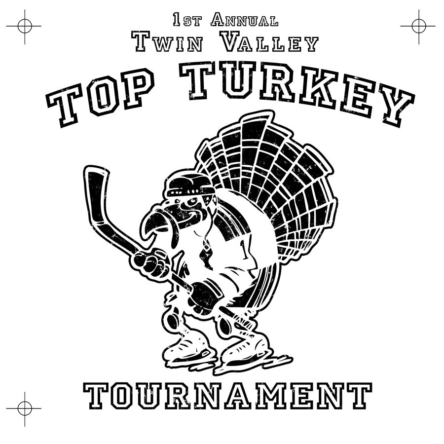
From this, I create a bitmap that the printer can burn the screen with, this is a simple one-color design so that’s just one image. Sometimes a printer will want to add a base coat of white though, so I added some registration points to align the screens should they want to do that. I hope it’s not necessary, the ink always ends up too thick when they do that.
Here it is:
Behold, the Mighty Turkey!
Have a great weekend!


Love you work, Rich! Hats off to your friend Tommy for providing you with a good idea of what he wanted, and to you for telling us some of your mechanics and thoughts processes and for such a great finished product!
Hi Mike! Glad you liked it!
Nice job! Boy, do I remember looking for reference in my “morgue,” what a time eating pain in the neck. Some things weren’t better in the good old days.
You said it!