Fish Print: Pink-Bearded Buzz Bomber
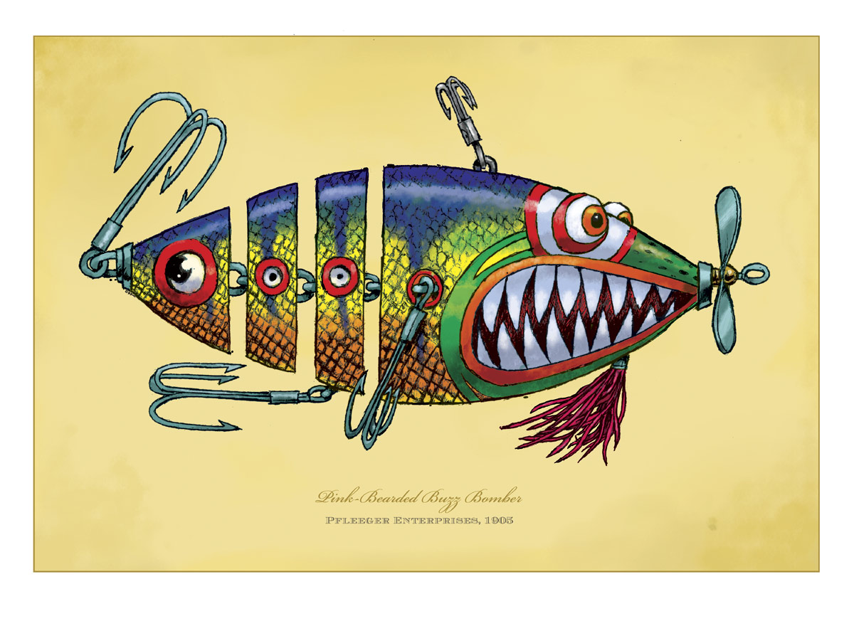 Hoo-Yah! Got the color done on the new “lure” illustration. I showed you all how I was cleaning up the pencil and readying it for color, now I can show you a couple of tricks to the coloring process. I’ll take some shots of the process including the Photoshop interface so you can see some of the settings, if you’re interested. It’s all pretty rudimentary stuff but, maybe there’s something simple I do that might save you time. You’ll notice I’m still using Photoshop 7 for my illustrations. Yeah, yeah…I know. I use my CS for working with photographs but I still love my old 7 for cartooning. I’m using a wacom tablet as well.
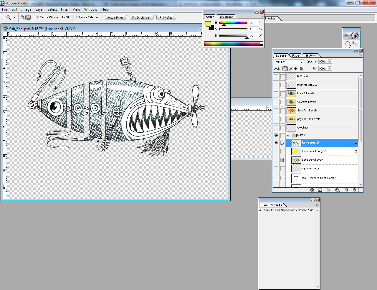
Here’s the cleaned up pencil. You can see I’ve eliminated all color from around the fish itselsf. This isn’t entirely necessary but I did it for a time-saver. I’ll show you why in a few. So, If you look at the layers, you’ll see I’ve locked the transparency and the pencil layer is set to “multiply”. This way, the dark pencil lines will overlay the colors that I’ll place beneath and the white will appear as transparent. First off…I’ll duplicate this layer, place the copy beneath this one and do a Fill of a color that I think will be predominant in the finished work. Yellow, for this one (unless I change my mind!)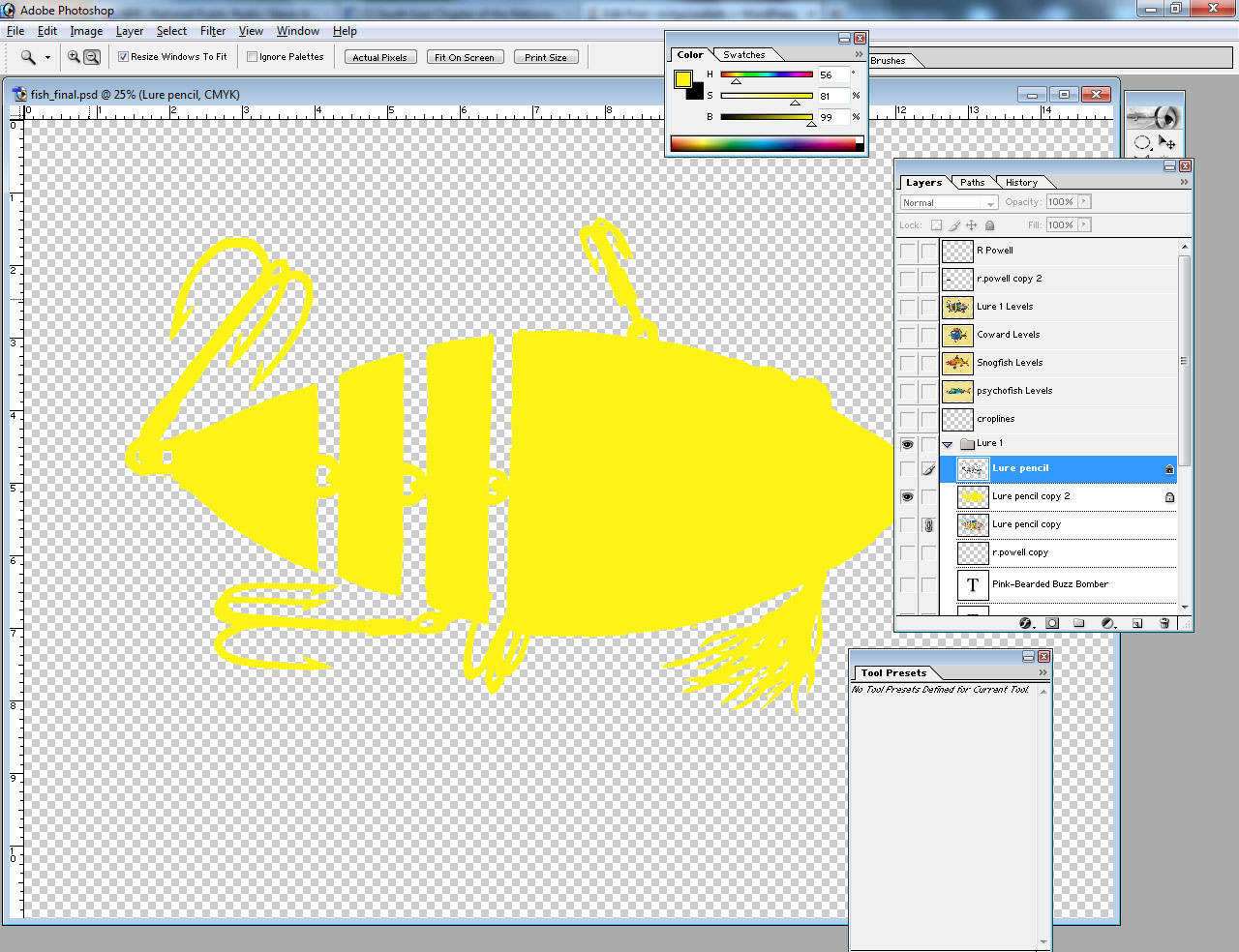
As you can see, the transparency was locked and now, everthangs yeller!
As I turn on the “multiply” layer above this color layer, you can see how it works. The black lines darken the lighter yellow beneath them and the line is revealed over whatever color you want to lay down below. 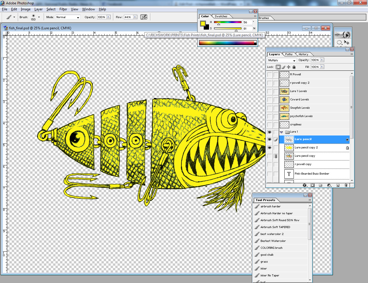
Now, having made sure the transparency is locked on this layer as well, you can begin to add color. I’ll do all the hooks first, using greys. When I’m done with them, I’ll simply select the yellow with the magic wand, hide the selection and add color to something else! That way, I won’t accidentally color the hooks I’ve already colored. Get it?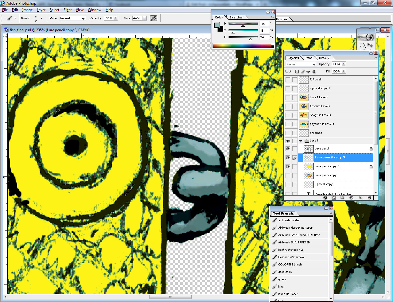 What I’ll typically do, I’ll add the initial color using my “ink” brush as a flat, hard-edged color. Then, I’ll use my wand to select that color and add the darks and lights to it.
I’ll do this over and over again until I get the colors finished. Some folks will be really anal with this process and make a seperate layer for each color. This isn’t a bad idea when dealing with picky clients who make color changes to your artwrork! I’m working for myself here, so screw that! I may tweak the Hue/saturation to something after I’ve added a color while it’s still selected. I’ve made many color decisions in that manner.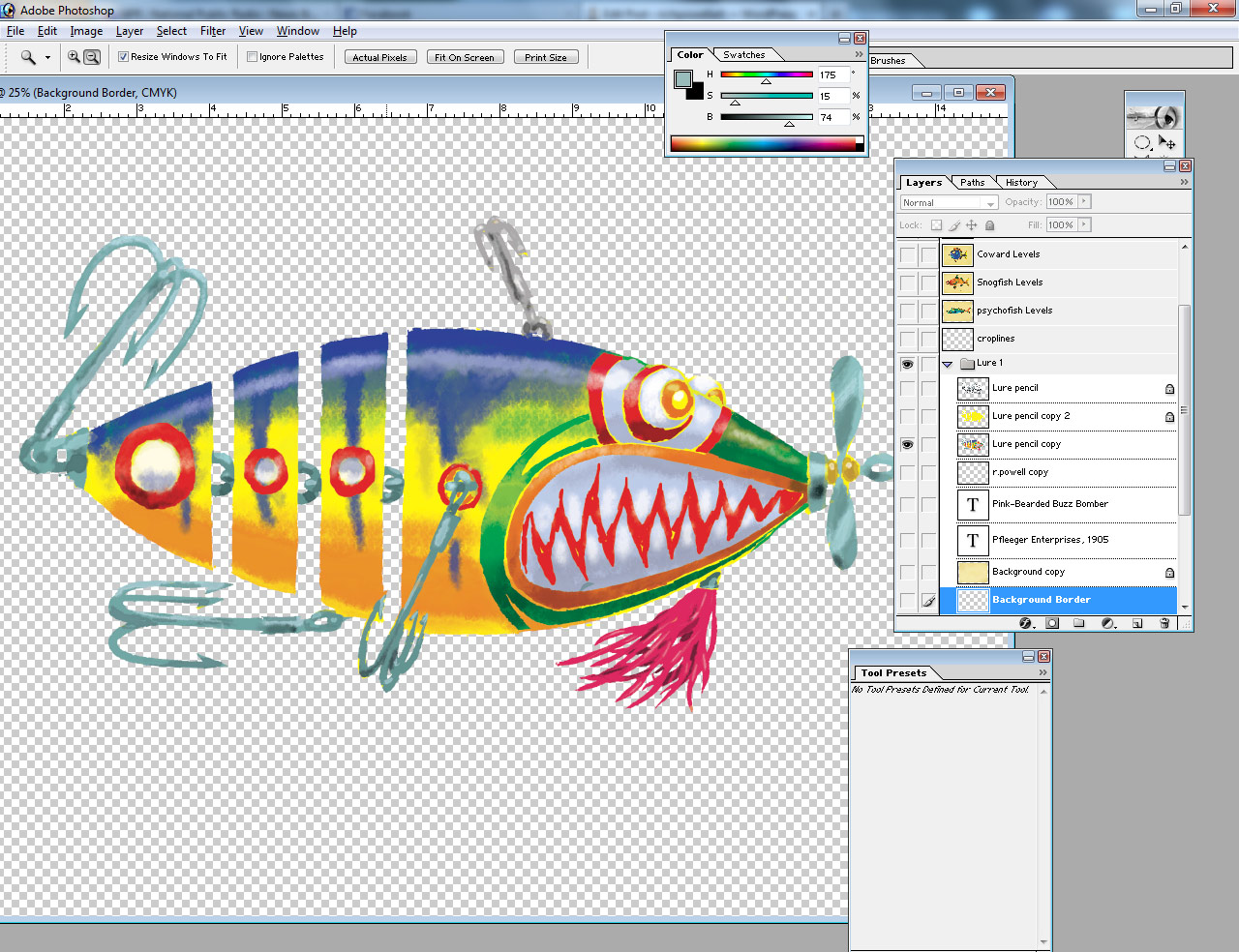
Here’s what you end up under the pencil:
Next, I reveal the background and flatten the whole thing. From here, I may tweak the levels on the flattened work to get the right saturation and contrast.
Voila!


I love it