Juggling Colors
T-Shirt design can be a pain in the butt. You want a really cool design but you also need to think about the client’s budget. The number of colors you use in a design can really put a whammy on the pocketbook what with set-up fees and screen fees. Typically I like to max out at 6 colors and to use the color of the shirt in the design as well.
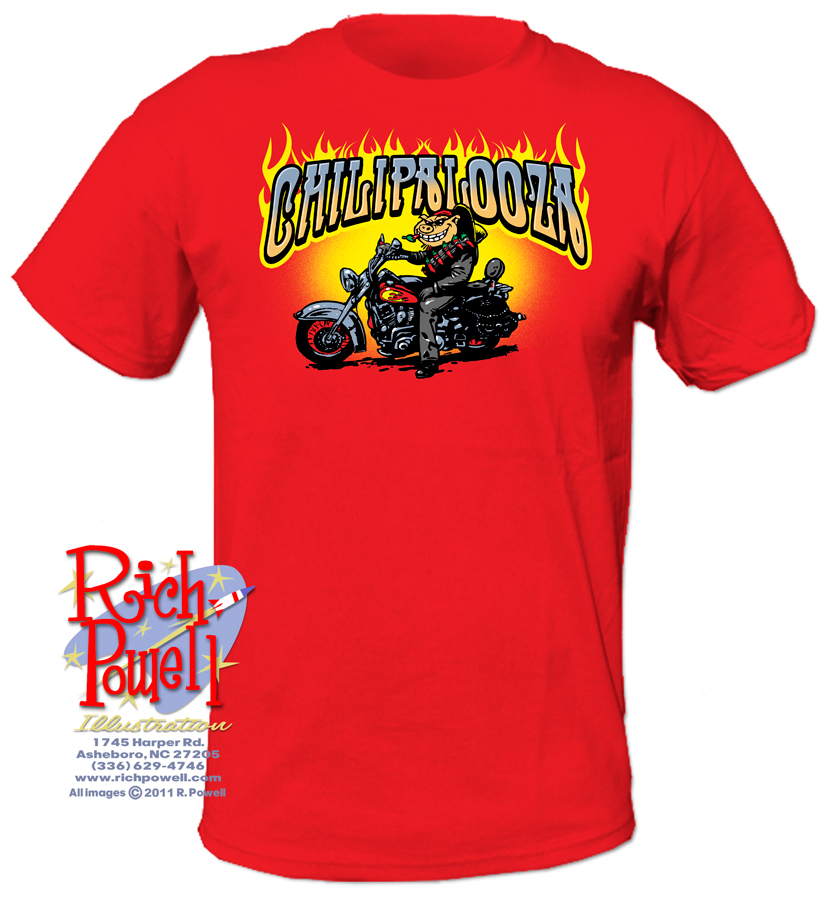
Today I’m trying out different things with a Chili Cookoff shirt. I know it’s a fundraiser so I’ll try a simple two color idea first of all. The event takes place at a Harley Dealership, by the way.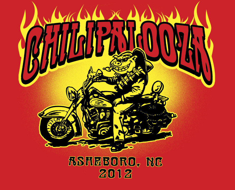
The gradient behind the character is tricky. You need to make the little specks of ink pretty distinct to work on a screenprint.
This is looking pretty bland. So I added another color to see what that would look like.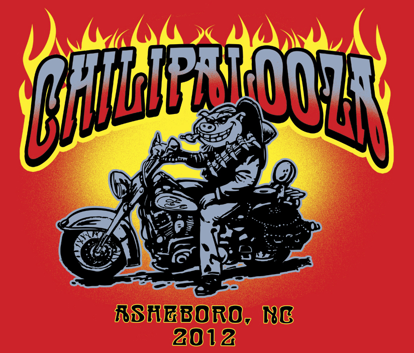 Often a dark shirt will need a white “flood coat” below the colored inks to properly display the colors but I think this red may be light enough. This looks a little bland too. Maybe I’d use a brighter blue if we went this route.
I skipped the 4 color and went straight to five. The client was excited about the design and really wanted to show off the event (he also wanted to charge a good price for the shirts and felt that more colors would bring a higher price)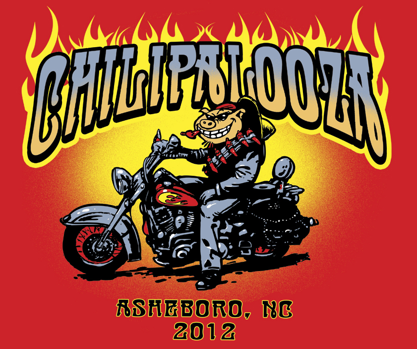 .
.
I’m beginning to like the way it looks. He’s starting to pop out here.
This is when the client said “to hell with it! Do 7 colors!!”
It’s amazing what so few colors can accomplish in a design and how important each is to the finished product. You can always go with a 4 color process (c,m,y,k) but that looks less crisp to me.

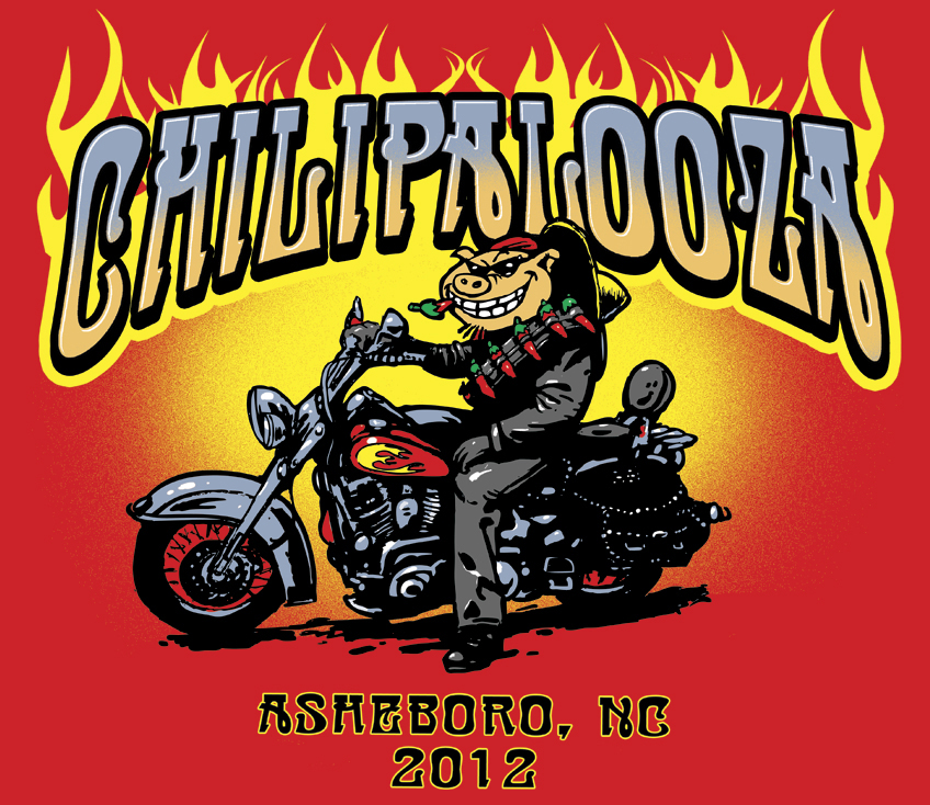
AAH! I love t-shirts. They are package designs for people. Great job!
Clients often do not understand that black and white count as colors and an undercoat of white would be an additional, second, white. The number of colors on a dark shirt can add up quickly.
That’s hilarious Ernie. I never thought of that! “Packaging for people”