Journey of a Logo
As I was adding the Portfolio page to the blog yesterday I was amused to look at some of the logo work I’d done in the past. I haven’t done any in a while and it was a little strange to see some of those old designs and remember the process of creating them.
I typically work digitally from the get-go with logos if they’re going to be real graphic. If there’s a character involved that’s a different story. See this. One that stands out as a particularly difficult logo was the Randolph County Public Library’s update to the 21st century.
Initially I was told that they wanted something fairly modern but also containing a local reference. Also “think movement of information” was a term I think I heard. Well, we have two rivers here in the county: The Deep River and the Uwharrie. I began with this idea, rivers of knowledge and all that. It was a starting place at least. See the “R C”? yeah…sorta lame but it gives the client a place to begin the thought process. I think they liked the rivers but wanted something more modern. I came up with this next:
I know…three rivers. It just didn’t look right with two. I also was given a color palette.  I like to start in black and white usually. A logo should look good in black and white. Here’s another try in color.
 Bird/Book shape? Nah. “Let’s try some straight book ideas” so here goes:
- Futuristic Floating Books!
- Ominous Giant Books
- A pinwheel of books. I was drinking by now.
- Straight Book…too much black in the center
- Moe of a classical look
- The addition of a CD. How terribly modern! Terrible.
Okay, so we’re going in a thousand directions but I’m doing these rather quickly. This is why digital works well for these type of ideas. I can create simple shapes and slide them around on top of one another, twist them…sometimes you get a happy accident.
I can’t remember what happened but I switched gears and tried something completely different. The turning pages conveyed the movement of information, the top curl is reminiscent of an R ..okay that’s a lie. It looks cool though. The pages are too thick so that needs tweaking and…the client liked it. Here it is, tweaked and clean. Next, colors! I tried a few combinations.
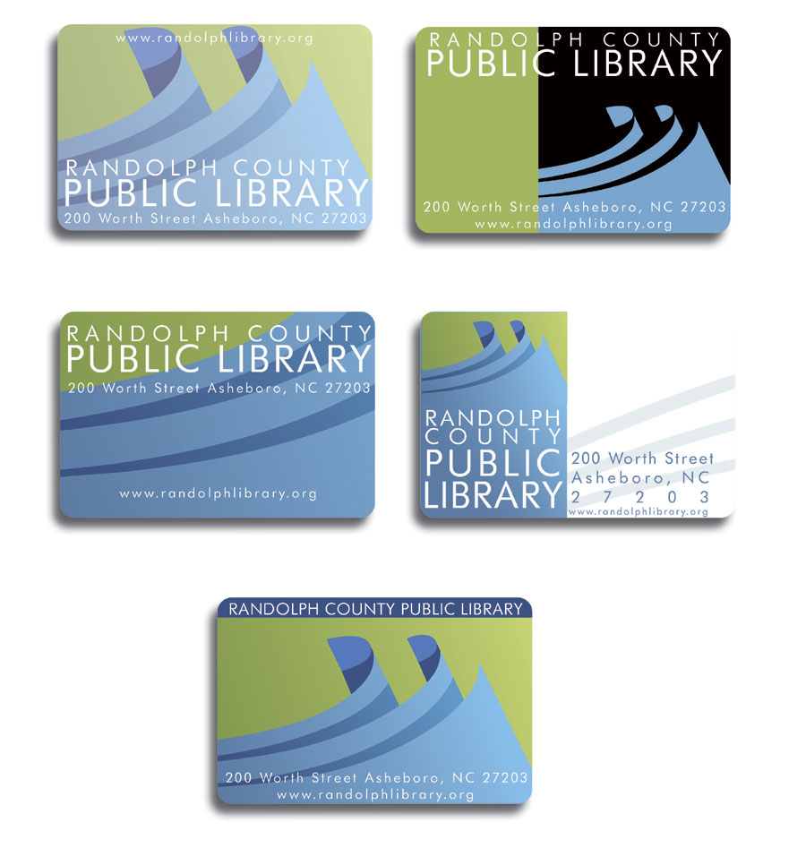
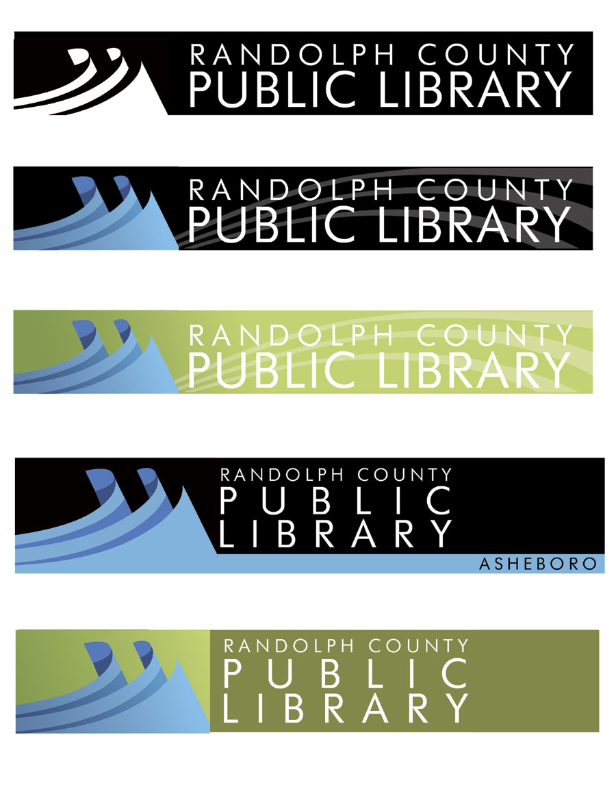
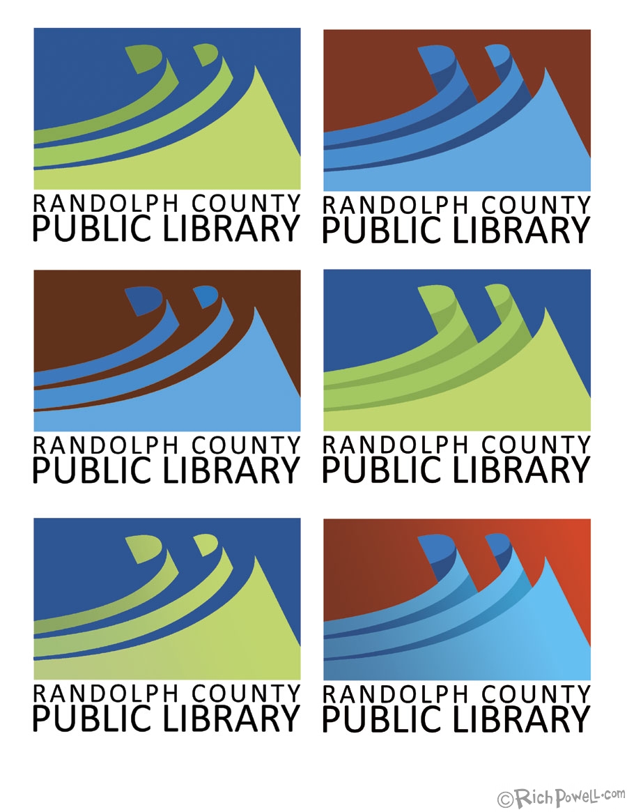 Once a combination was decided, we looked at uses such as Library Cards and Web Banners, Letterhead etc. I worked with the graphic designer at the library to figure out how to work with the logo and elements of the logo.
All that was left was Getting Paid. There should be a link to a post detailing this step but I haven’t figured it out yet!
See ya-
Rich




I work for a small library in MI as a graphic designer. The library needs a new logo, although they never really had one to begin with. I’m not getting any respect from the director, so I would like to knock their socks off with a design. Problem is they haven’t a clue what I need to start. Like maybe some direction. Recently they decided to modernize, pretty much like what you described above. Our library doesn’t have an identifying features except maybe a lot of trees and the building has square glass windows like a grid. I did a logo with a book as a gate since their tagline was something about being a gateway. I was told it was “pretty” but not the direction (so now they have one) they wanted to go in. They want something modern, graphic, I assume. Thanks for letting me see your thought process. I love your final, promise not to steal!
I’m glad it helped. I often go looking for something to jump-start my creativity, you gotta see what somebody else tried!