Inching into Highlights
A couple of months back I got an email from the art director of Highlights For Children Magazine. They inquired if I could do an illustration that revolved around a poem concerning a sidewalk crowded with inchworms. My first thought was “Sweet!”‘ My second thought was “More Bugs?!” You see, I’d just finished doing a series of bug illustrations for The North Carolina Zoo’s ” Bugs! An Epic Adventure” exhibit. I guess I thought that was kind of a weird coincidence. But…. Who cares? I got a gig with Highlights!
You remember Highlights from visits to the dentist’s office, don’t you? The Timbertoes, Goofus and Gallant….the hidden pictures? Well,I certainly did. I remembered fondly! I couldn’t wait to get started on the illustration. The magazine works well in advance of its publication date, a couple of months in fact, and that thrilled me as well. I’d actually get to spend some time working on the illustration and not have to rush to get it done.
Working with the art director was a pleasure. They real laid back guy. Here’s the process:
My initial sketch consisted of a few caterpillars to show the art director how I would approach the subjects. It was to be a busy street scene and I wanted the characters to be able to be doing certain tasks so I needed them to have arms. The magazine requested that the inchworms be represented in an anatomically correct manner (within reason) So, here’s what I came up with:
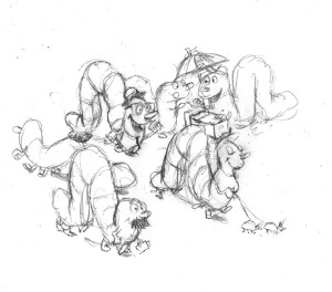
Basically the inchworms have torsos and a series of “butts” that string together to make them inchwormy! My favorite idea was the woman walking the ladybugs. Here’s the cleaner pencil of the entire crowd:
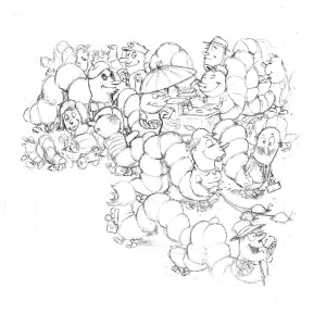 I’ve juggled folks around and tried to add enough little interactions for the kids to linger on. The space for the illustration is rather small and I have to work around the poem. I almost wish it was bigger so I could add loads of gags…”Chicken Fat” as the great Will Elder would have said.
Here’s the feedback I got:
This is SO cute and funny! Let’s adjust so that title doesn’t cover any of the art (especially heads and faces).
– Let’s avoid “lipstick lips,” chests, and too much hair on the women (looks wiglike). Eyelashes, jewelry, and girly hats are OK!
Rich, you can go to final with these changes.”
That was nice. Always glad to have a client thrilled with the initial work! Below is the next revision that I floated past them before color, just to be sure.
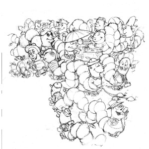 .…and here’s the Final! Go and see/hear the poem on-line HERE at HighlightsKids!
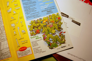
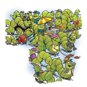 And..here it is in print! A big shout out to C.C. Williford for the cute poem!
Adios!
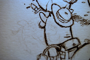
ADDENDUM!: The mysterious Mike Lester thought it’d be a good idea to show you how I went from pencil to ink: I inked it. Okay, wisecracks aside. Here’s the full size artwork (Strathmore Mixed Media pad) on which I inked directly over the pencil and selectively erased. I like to leave some pencil behind to give the inks a nice rough look when I scan them in and pump up the contrast a bit. (I use Photoshop 7 to this day. It works for me. If I’m going to screw around with photos I’ll use CS5)
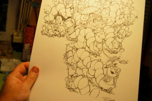
Here’s a close-up. Lookit the ghosts of characters past!

Awesome!
Tell people (me) how you did the line work (it’s black. How’d you go from pencil to solid black) and how it you colored it (photoshop? itinerate painters on visas?) dammit.
The pencil to black is a trade secret, I’m afraid. You’ll have to buy me copious amounts of scotch in San Diego to pry it out of me. As far as the coloring, I have have it done in Korea by Jewish Mexican squatters.
Oh, wait….this one was easy. Ink!
Corey liked your inchworms. We still get highlights. We’ll be looking forward to the next issue.
Cool!