On a Lark
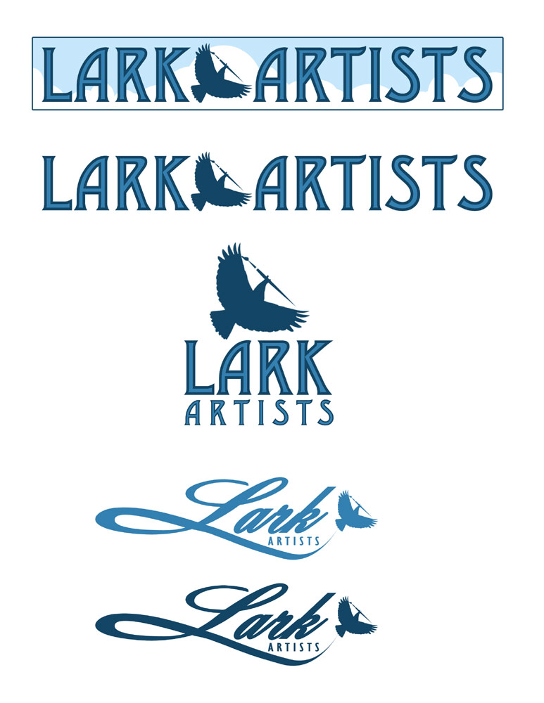
Working on a logo today, converting it to vector from a Photoshop mock-up. First of all I needed to get the group to come to a consensus about which Lark was the right one. I submitted a few samples.
It’s tough deciding what to show a client, you don’t want to show everything because if you do…they’ll pick the crappiest one!
I was pretty happy with the idea of a playful Lark holding a paintbrush so I stuck with one version of that. If they didn’t like that one, so be it…back to the drawing board but, if I’d shown a few samples, I might confuse the client and would most certainly be wasting my time on the versions they toss away.
I liked the idea of the shape of a script “L” creating the swooping trail of the Lark snd tried it a couple different ways.
In this version it’s a very formal logo. I found a nice L to use and added to the lower “swoop” to frame the word Artists and to follow the bird to the end. Sometimes it’s tricky to get the addition to the font to match the curvature of the original letter. With the L it helped that I could begin to the right of the slanted, vertical line of the letter.
This next sample shows a more playful direction for the font and there’s no paintbrush. I think I may have done this one first. One of the clients liked it but the rest wanted a more professional look.
Hence, the formal sweeping L of the top versions and the top font (Dustine) that reflects the “arts and crafts” movement.
This top logo was the one the client went with. It would be nice to be finished at this point but from here, I’ve got to convert the ting to vector art.
Many clients have no idea what I’m talking about when I say that.
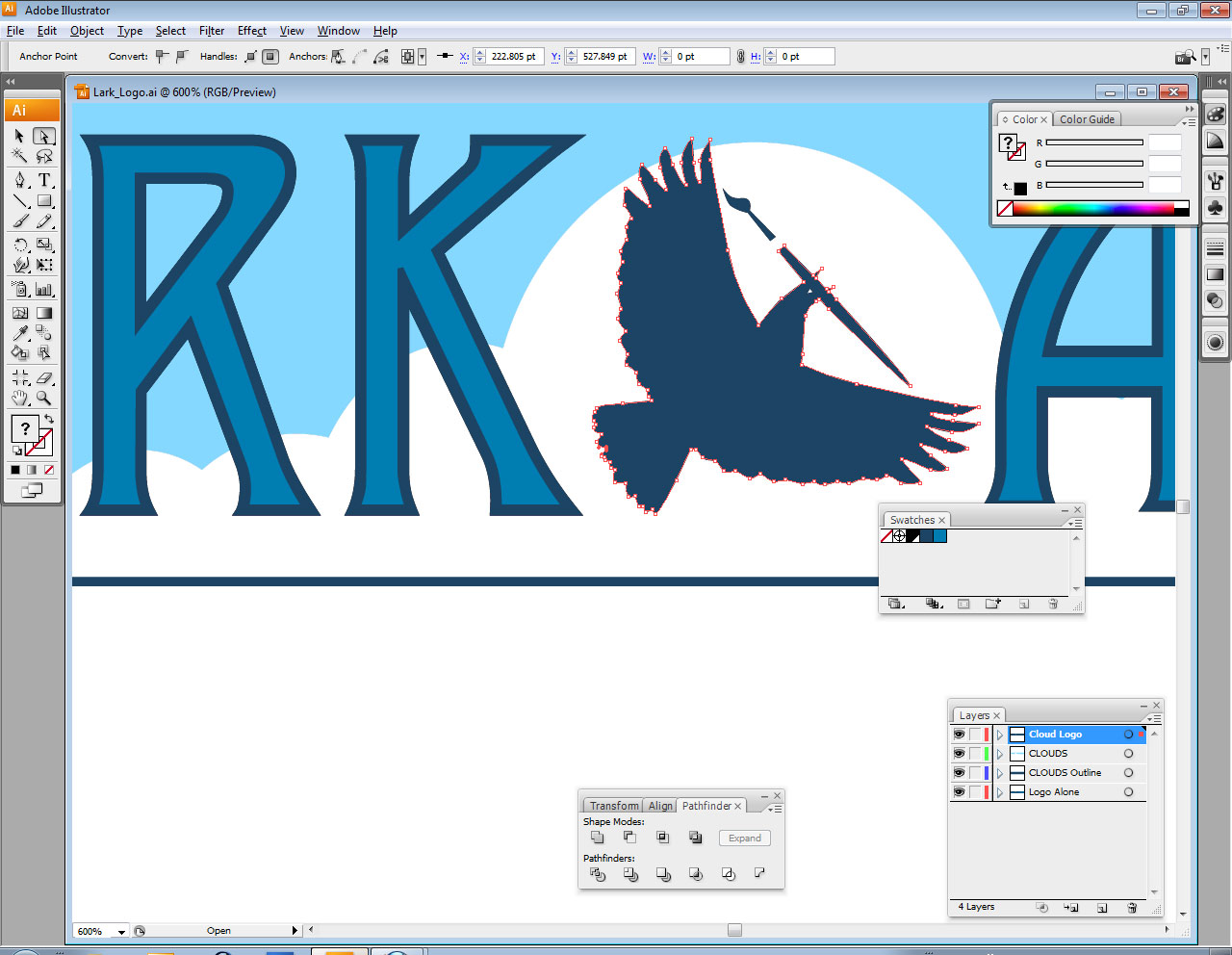
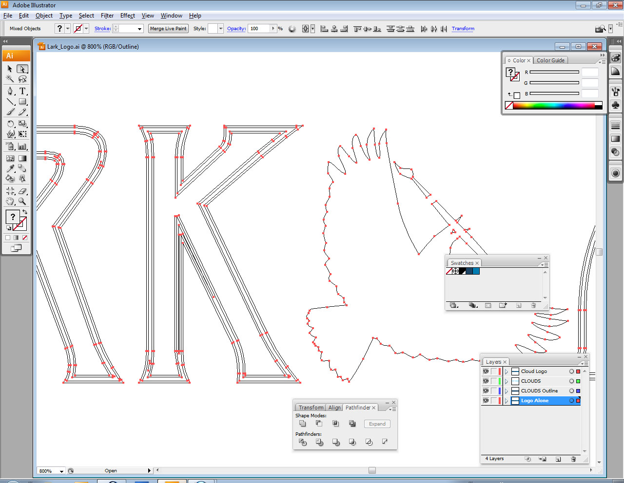
Basically, vector art is made up of paths that form the direction and border of lines and fills. That way, the art can be endlessly blown up to massive sizes without any loss of a crisp edge. The curves of the paths simply recalculate as they’re resized.
Here’s a shot of what I see when I’m, using Adobe Illustrator to create the art in vector. You can see the little points on the outline of the bird that represent curves on the path.
Here’s another shot of the art as pure vector, hiding the fills of color:
So that’s it. The logo is now complete. Colors can be changed easily at this point and elements can be juggled around. The art is now ready for a myriad of uses, web, business cards, t-shirts and more!

