Clients: Go Figure.
It never fails to amaze me. You work through many revisions of a logo for a client, tweaking things to make them just right…little things: “make the color just a shade lighter” or “Can you arch the eyebrows just a bit?” and, after all of that, after they’ve paid for the logo and had it send to them in a myriad of formats that allow them to use it in a myriad of applications…. wait for it….they take the thing into Gimp and change it.
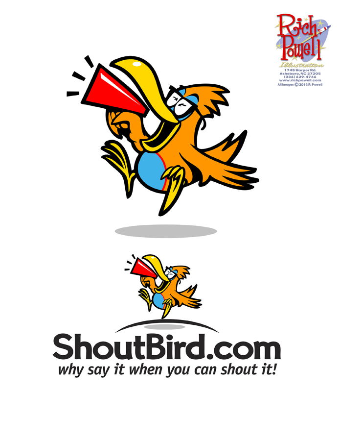
Here’s a logo I did for Shoutbird. I mentioned it in a previous post HERE.

The little guy is joyfully shouting out the news to the masses who’ve taken their eyes of of Facebook for a brief second.
Here’s how it ended up:
Whoops. Looks like everybody got shorter. Shout that news DOWN little guy!!


Bummer–someone got hold of the “rotate” button!
Haha! Yep! Glad that’s ALL they got a hold of!
I’m sure if you let the client know of your displeasure with their fiddling around they will just ask you if the check cleared. But, don’t feel bad, this have been going on for centuries. I heard from an Art restoration expert, who was contracted to examine the Sistine Chapel, say that if you get right up close to the image of God, you can clearly see where the Latin phrase for: pull my finger, has been painted over. He isn’t sure if it was some sort of
Jesuit graffiti or if it was actually written by Michelangelo.
Macarthur, you need help!
Their version looks like he’s yelling at something on the ground and chasing it. I think yours has a better energy and gets the point across better. But who are you…just the designer dude!