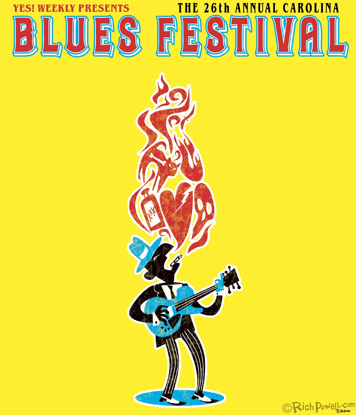
Carolina Blues Festival Poster
Here’s the winning concept I submitted to the Piedmont Blues Preservation Society this year. It’s very tough to design a poster without knowing what text accompanies the art. I have no idea how the guy last year got hold of the line-up ahead of time but I figure he must have because it’s incorporated right into the artwork. Katie Thompson, art director at YES! Weekly did a good job of juggling the text around the central image, it was a challenge! Here’s the poster with all the text incorporated.  I was very pleased they picked this artwork for the fest, it’s a departure from your standard blues stuff, that’s for sure! I’m also looking forward to going backstage this year! Come out and see the show and see me too!
PS-If anybody from the PBPS is reading this, please let me design the t-shirt!
Cheers!


Very nice, Rich! Although I hate it when an awesome piece of art gets all cluttered up with text. 🙂
Thanks Nolan. Oh well, it was a contest after all and the text needed to be in there somewhere. It’s a challenge to both the artist and the designer who has to add the text afterwards!
Eric Gales is worth the ticket price …oh yeah nice Poster
You da man, George!
Black Cat Bone ….Love it …no You Da’ Man
I forgot the Mojo Hand.
Congrats Rich. Great work.