So, I got an e-mail out of the blue the other day from good ol’ MAD Magazine. It was a welcome gig as everything else I’m furiously working on won’t be actually filling my coffers with moolah for a while. It’s an investment in time and stress!
Whenever I get an assignment from MAD, the deadline is “yesterday” and that sort of sucks. It means I have to work as furiously fast as I can from concept to finish and I always feel that my work isn’t the best it could be when working this way. Hopefully, in the future I’ll have a little more time to add all the details I’d like. Look at Will Elder’s stuff or Tom Bunks…there’s crap everywhere and it’s funny! Elder called it “Chicken Fat” I don’t know what Tom calls it.
So here is the initial e-mail:
Hey Rich!
I know it’s been some time since we sent you a job, but your name comes up often, and we’ve got something we’d love you to illustrate for our next issue. It’s a Fundalini piece called “Features Of The New Boeing Dreamliner Jet.” We’re illustrating the line “Larger windows so passengers can see just how far the plane can go before being diverted due to electrical problems.”
We’re setting the scene outside the plane as it’s starting to move down the runway. This plane has huge, bus-like windows, through which we can see a bunch of frightened, horrified passengers. Why so horrified? They can see sparks flying out of the engines, wings, wheels, etc. and the air traffic guys frantically trying to get the plane to detour off the runway.
Layout is attached.
The layout looked like this:
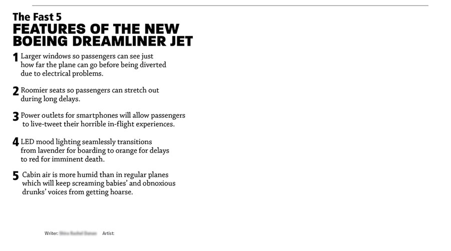
So, I’ve got that little space to the right of the text to fit the world’s largest airliner and all of the stuff flying off of it, the passengers, giant windows etc. etc.
My first thought was that I’d have to draw it from the rear so we could have whatever has fallen off is bouncing back into our face. We could have LOTS of chicken fat if we were to do that!
First of all, I had no idea what a Dreamliner looked like. Google it!
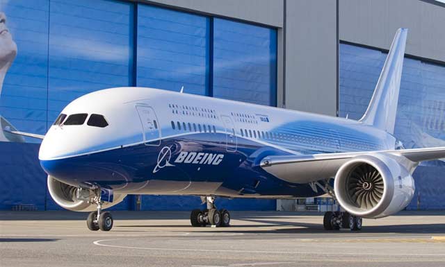
Looks like an airplane to me. Doesn’t even look all that big. Oh well, I guess there’s not much super-unique that I’ll have to add except maybe the paint style.
I quickly whipped out a sketch and e-mailed it off. The Art Director was out in California at Comicon so, I figured he’d check it out on his iPad or something. Here’s my first image with the plane being viewed from the rear. I figured I’d add lots of sparks using simply color (that’s why they’re not apparent in the sketch) and I’d also add more stuff while finishing it if they approved it quickly and I had the time:
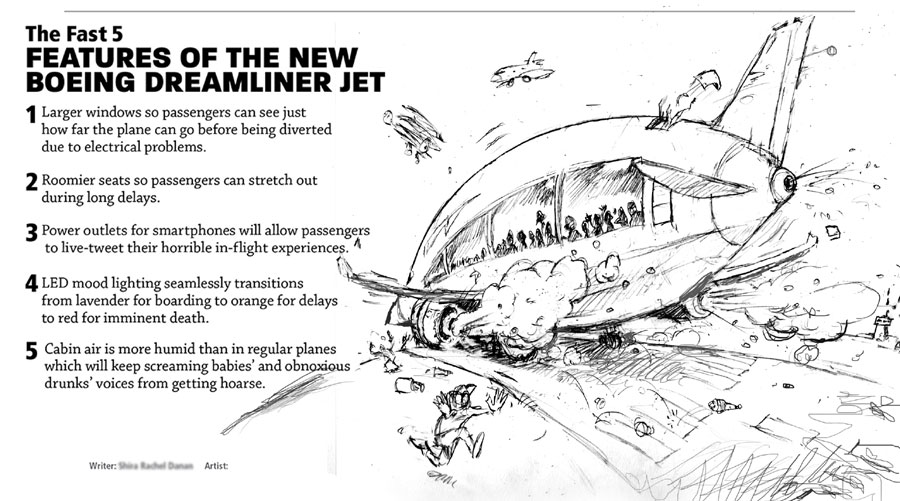
I waited a day….the answer was NOPE! Make it coming at us and therefore giving us a more menacing feel. I’m not one to argue much unless I feel really strongly about an idea. This would simply be more of a challenge. So, here we go:
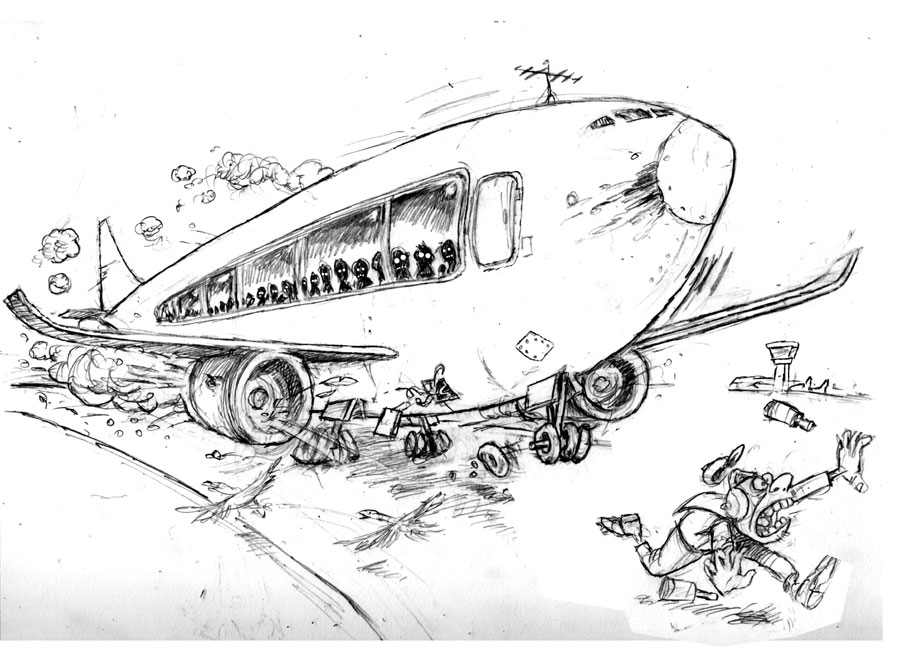
Sketch 1: Rough Pencil. Approved! You can see I tweaked the guy in front a bit.
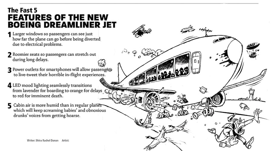
Pencil cleaned up, Ink applied
I’ve also added the infamous MAD zeppelin. I had a drawing I’d done of it a year or so ago so that was nice, no need to redraw it. Now I’ll show you how I add the colors in layers using photoshop:
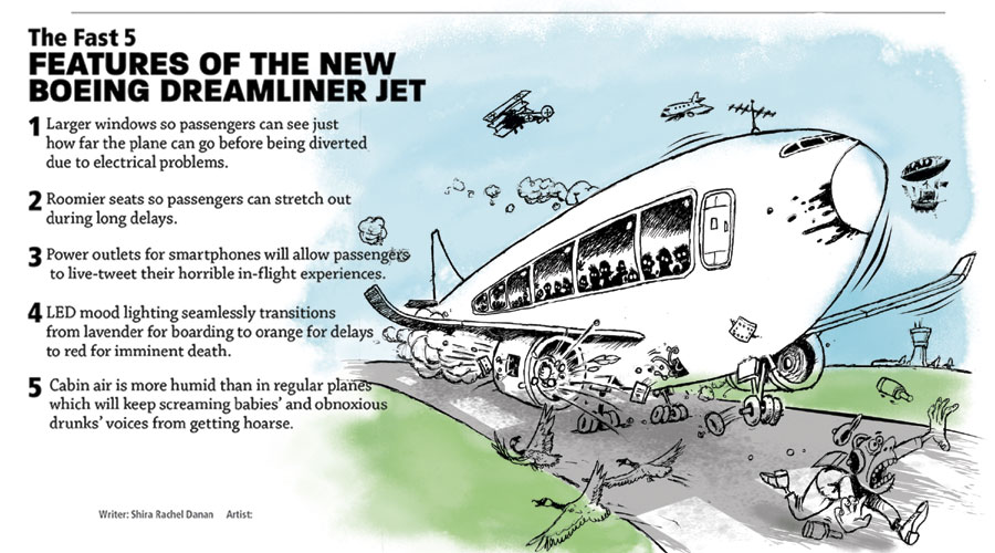
First layer of color
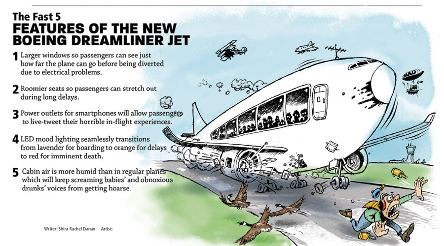
Adding more
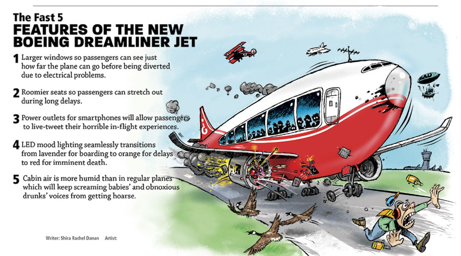
..and the rest. Boeing paint job applied!
…and here’s what it printed like:
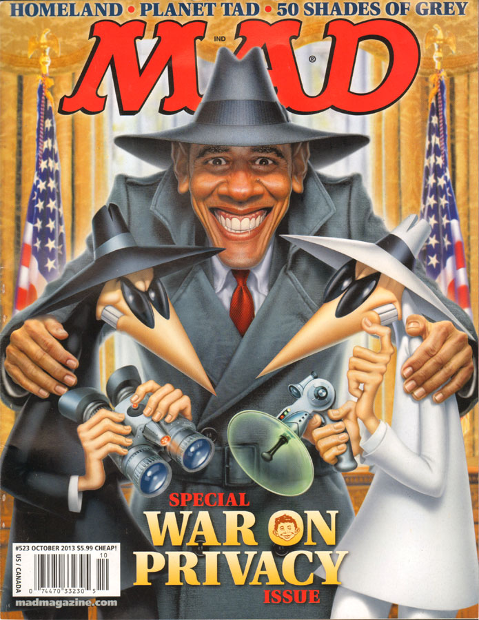
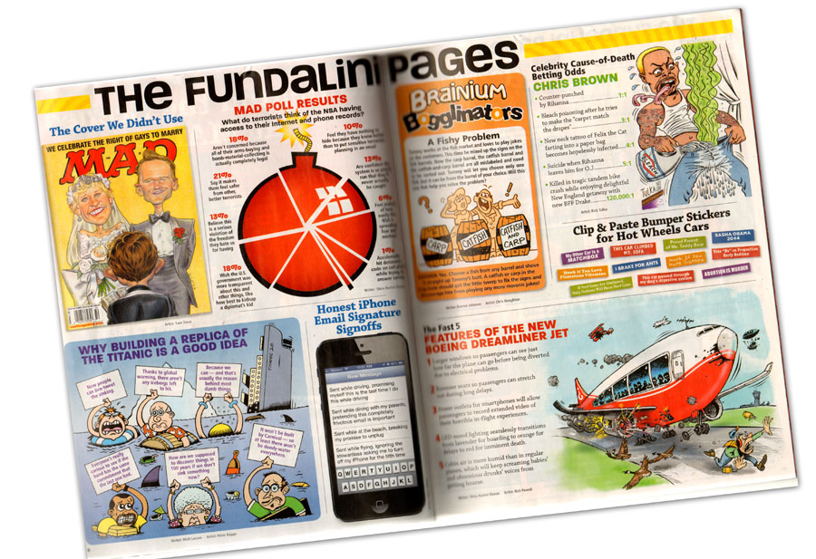 I have no idea what that dude with the stinky underwear is about. There’s a great Tom Bunk page in this issue and even a piece by Paul Coker Jr!! and….of course the Fold-In, still created on the fly by the great Al Jaffee. Some things thankfully never change! Get out there and get your copy of Issue #523 Oct. 2013. Visit MAD’s page Here.
Like this:
Like Loading...

 I waited a day….the answer was NOPE! Make it coming at us and therefore giving us a more menacing feel. I’m not one to argue much unless I feel really strongly about an idea. This would simply be more of a challenge. So, here we go:
 I have no idea what that dude with the stinky underwear is about. There’s a great Tom Bunk page in this issue and even a piece by Paul Coker Jr!! and….of course the Fold-In, still created on the fly by the great Al Jaffee. Some things thankfully never change! Get out there and get your copy of Issue #523 Oct. 2013. Visit MAD’s page Here.


Just plain great!
Far Out Rich!!! I love knowing famous people…..
Actually we flew on this plane from Asheboro International over to Ramseur FRA-DFW….Very pleasant sedated trip…..