The Flying Booofalo!
Years ago, in Berkeley California, I used to check out blues bands at a cellar club called Larry Blake’s. It was a dank little cellar with a bar, (restaurant up top) where you could see big names close enough to get a spit-shower from their harmonica. Alas, it’s gone now.
It was at Blake’s that I had my first “buffalo wing”. Now, it did not resemble what you get nowadays when you order the mythical appetizer, these were marinated and broiled (I think!) but they were served with the blue cheese and celery. Anyway, they were GREAT! Little did I know that one day I’d be doing a buffalo wing gig.
My buddy Rodney owns a print shop and won a bid to do the promotional stuff and menus for a new place opening in Lexington, NC called Christo’s. They were after a buffalo mascot so Rodney got on the Batphone and gave me a ring. I love doing mascots.
The thing is, I always have a favorite design and try to push that one but the client sometimes chooses one of my lesser designs and that frustrates the hell out of me. Rodney asked for some sketches so I went to work. I may do a ton of sketches and toss them out and, when the time comes to present, I just pick ones I see as viable, hoping that one stands out as the clear winner. That looks like what happened here. Here’s the first page:
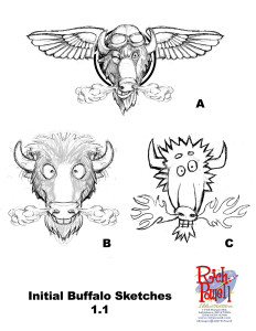
and the second:
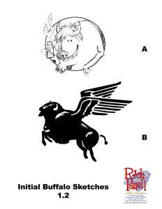 Like that riff on the Mobil Logo? I don’t! You can see which one I liked, I spent a lot more time on it. Sometimes I get lucky and this time I did. They bit right away! They were torn about the helmet though. Seems like a no-brainer to me. I think the vintage flight helmet adds some character. Here’s the way it worked out:
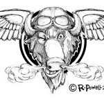
- My Initial Sketch
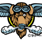
- My Favorite, with the Helmet
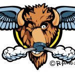
- Sans Helmet. Their Choice.
So, they chose the bare-headed buffalo! Who am I to judge?!! Looking at the menu, I like it.
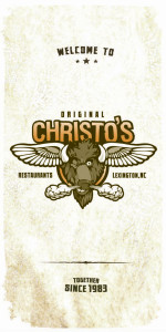
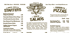 I’ve never been to Christo’s but hope to try it out someday. I know I’ll be longing for my Blake’s Wings but all good things come to pass.
Abbondanza!


I chose the buffalo with the helmet. Your work was well done. The one drawing of the buffalo with the Mobil Gas horse’s wings looke too much like the Mobil logo. Your do great work Rich! Keep it up.
Yeah. It was just the inkling of an idea (I think I called it the Texaco logo I the post! Whoops!) if the client wanted to go in that direction it would have been developed much further.
Definitely the one with the helmet Rich. It was a no-brainer! Nice!
I like that one the best too but I’m with you, looked better with the helmet. Good job my friend.