Blues you can lose
Tried out a couple of ideas for a poster contest a little while ago. The Piedmont Blues Preservation Society’s annual Blues Fest was having a contest. I’ve been scrambling to get work done for a variety of clients so it was tough, but I figured I’d kick myself if I didn’t try. It’s really hard to design a poster without arranging the required text around it! I threw together some compositions with plenty of room for the text but I was certainly flying blind. The only advice I’d heard was “avoid guitars” after calling the folks who would be choosing the poster.
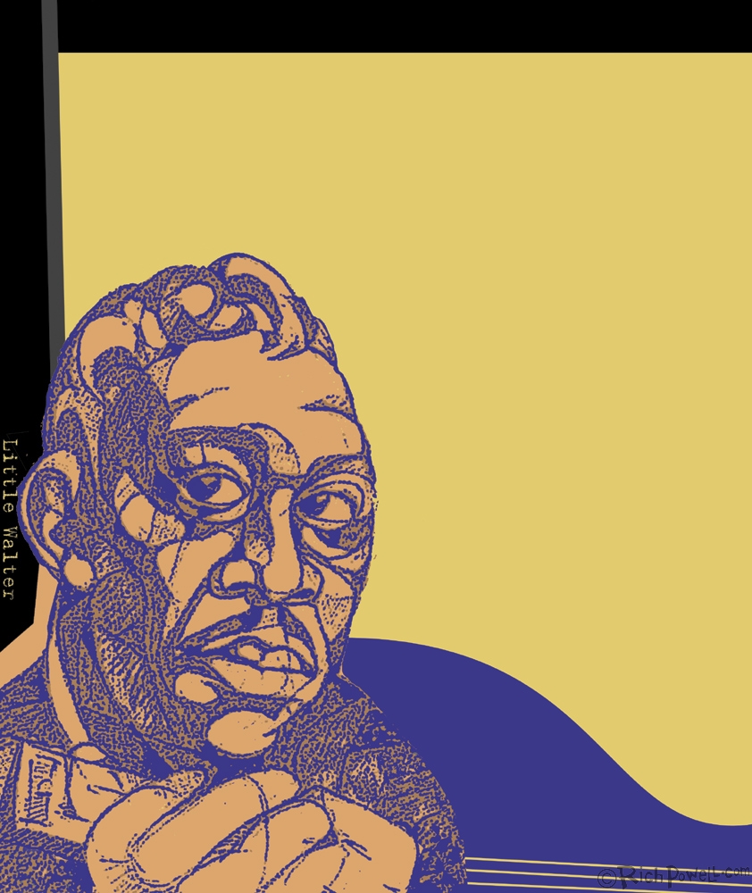
I had this really cool image of Little Walter I’d done a long time ago so I thought I’d try him out.
I’d originally drawn him in pencil but ended up xeroxing the sketch and playing with the contrast to achieve all that grain.
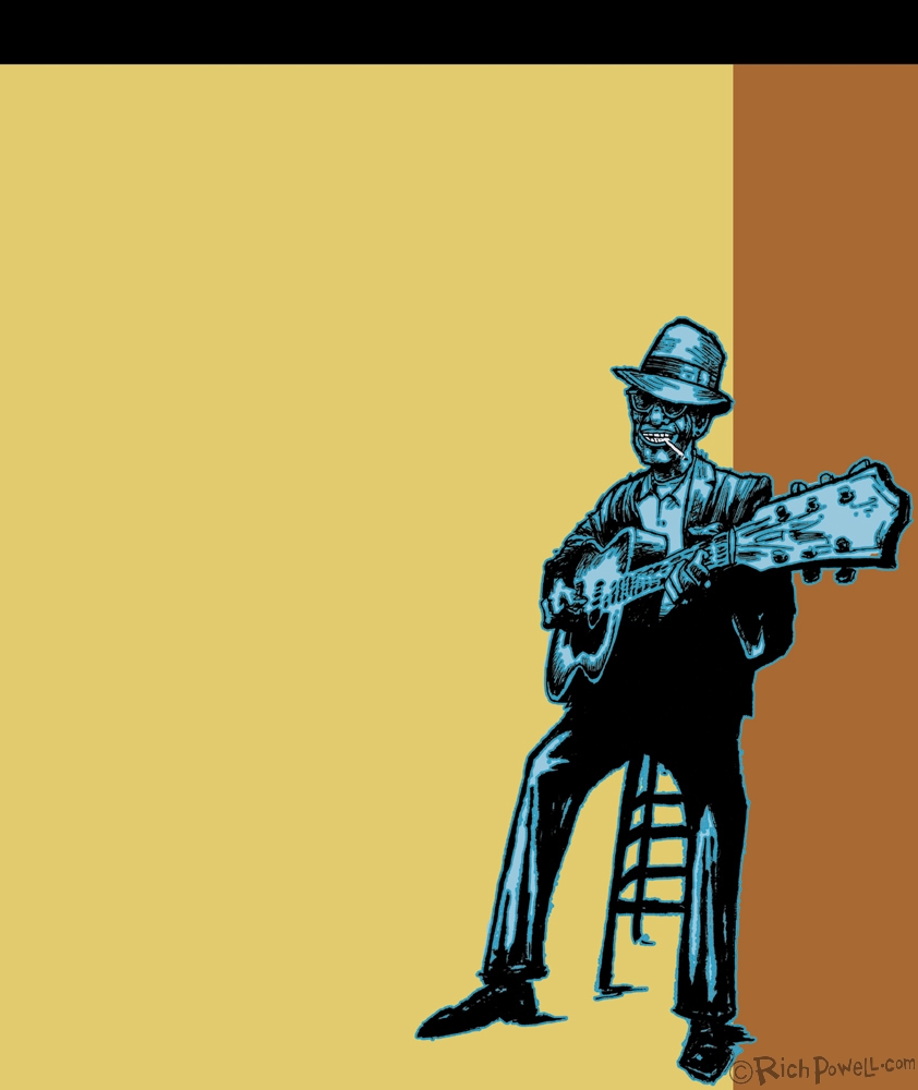
Next, I had the idea that I wanted to have a guy playing one of those kick-butt National Resonator guitars with all the cool holes in it. I know..”avoid guitars”. Well, I figured I could showcase the dude playing it as well. What I ended up with, after looking everywhere was good ol’ Lightnin’ Hopkins. I guess the idea of the “character” overtook the cool guitar and, well, Lightnin’ Hopkins is one of my favorite blues characters. Him and Sonny Boy Williamson. Have you ever seen the film The Blues According to Lightnin’ Hopkins? If you haven’t DO check it out. It’s a classic.
Anyway..here we are with all that space again. I like the drawing but not the poster idea. Oh well, it’s always good to step away from something and come back to it to see if it still works for you. I should’ve stepped away from this one.
I dunno…maybe if I’d layed out the text. Nah.
From there, I was still riffing on the idea of a design to sort of frame whatever text they were going to put into the poster. I thought maybe I’d avoid people altogether and do an instrument-based design.
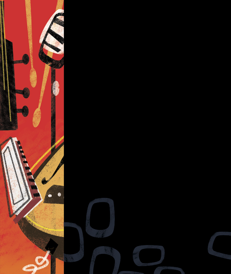
I think I have a couple guitars, a mic and a harmonica in this one. I like the little shapes in the black now that I look back at it.
Anyway, the day of the announcement came and it was off to Greensboro with my bro to the bar where they were going to announce the line-up and unveil the chosen poster. I had no idea if I was in the running or not but I wanted to be there if I won….and to have some beers and listen to the blues! So off we went. I ended up having a couple of glasses of some really good sangria they were giving out samples of, hearing some great music by this guy, Owen Poteat and watching them unveil the winning poster of…a guitar.
Actually, it’s a really nice poster. Check it out here http://www.piedmontblues.org/
Go to the Blues Fest!! You won’t regret it!

greetings by
http://flickrcomments.wordpress.com/2011/04/19/retro/