What I’d do for a drink: Take 2!
Beer. Such a simple word yet such a complex subject these days. When I was young, if you wanted a good one, you needed to find an import or (if you lived in the Bay Area of San Francisco) you were lucky enough to have Anchor Steam being brewed locally. In 1977 or near then, laws were passed that made it easier to brew Craft Beers legally and life got better for the USA.
Frankie and I visited Hayward’s Buffalo Bill brewery, run by famous photographer Bill Owens while we were attending Cal State Hayward and had our first Pumpkin Ale there. Remarkably, you can find that brew out here in NC around Halloween. We fell in love, with the beer and also with each other! She still puts up with me.
SO, I was thrilled to learn that Four Saints Brewery was looking to open here in Asheboro. A couple of guys and their wives, the McCloskeys and the Demings, have been brewing some majorly fantastic stuff over in Randleman and are hoping to go legit with a brewpub here in Asheboro with the help of a “Kickstarter” campaign? Haven’t heard of that? Think of NPR: You help fund the project and reap the benefits of its success! Plus: There are incentive gifts! One of them is Artwork…that’s where I can help. Being constantly broke, the best I can do is donate my time and materials to the cause. Visit their Campaign Page Here!
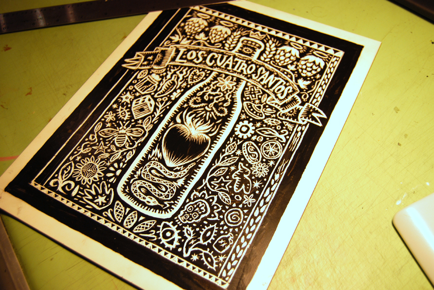
I decided to do a new scratchboard based in a Mexican woodcut style I’d seen somewhere, not unlike the shirt design I’d done for a different Kickstarter campaign for a documentary film being made by an old friend, Arturo Sinclair. I like the look of a bunch of symbolic stuff surrounding a central image, Looks like a representation of a magical spell, in a way.
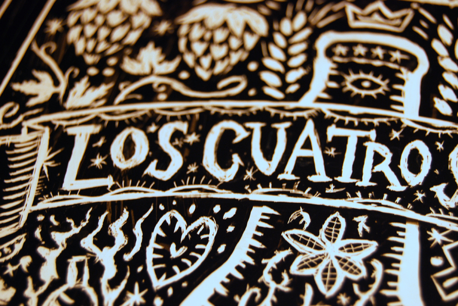
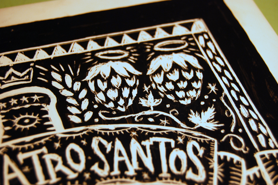
This image was not actually done on scratchboard but was instead inked and taken into Photoshop and reversed. It’s tricky to get the right look this way though. The beauty of the scratchboard is that it causes you to make mistakes that enhance the look of the image. It’s not easy to be precise and , depending on what you’d like your final product to look like, this can be a blessing or a curse. Not exactly a curse…a challenge, maybe.
Four Saints uses some unique ingredients in their brews: jalapeno, honey, smoke…and that gave me some inspiration for the content as well as some symbols that one associates with drinking. I was really looking forward to get started! I was going to wing most of the design save for a planned central bottle, Banner and the representation of the “Four Saints” as Holy Hops.
I almost finished it last night! Here’s where I’m at this morning. It should be finished tonight. Cheers!


Rich, I love your scratch board stuff! The logo looks great!
That means a lot coming from you, man. Thanks!
That makes me thirsty! Another knockout drawing……. how do you keep this up day after day Rich? Rough is good…artistically speaking of course!