Starts with “F”…ends with “UCK”
I had a strange request last week. My daughter’s boyfriend’s mother, Barbara called because her stepdad had a birthday coming and, as a man who has everything, she wanted to get him something unique. It seems he was a firefighter in Greensboro for 25 years before starting his own company and making his fortune in fire safety equipment. He had a favorite truck from those days: Engine No. 1. He scoured the countryside looking for that old truck, found it in some backwater (still in USE!) and bought the damned thing. He refurbished it and now, it’s his pride and joy. I met this guy, by the way. He’s a great guy and he cooks some mean chicken. Anyway, that’s why Barbara called me: to do a portrait. Of a truck.
Now, times are tight and I can’t go around refusing ANY work but I have to tell you, I have a hard time drawing vehicles. They’re really tough, all sorts of strange angles and shapes. A fire truck has all that stuff on it too and….it had to look exact. This is his baby. But what am I gonna do? It’s the daughter’s boyfriend’s Mom…and they’re really nice folks. She was a real trooper when I came up with a quote (not good at that either, especially for local work!) and we agreed that I’d pull it off for what she felt it was worth.
So how was I going to do it? I’m not going to fool myself and pretend that I’m a photo-realist. I mean, I can do that with much hand-wringing and hours of hard work but I hate hand-wringing and hard work! I’m at the point in my career where I’m trying to find the joy in what I do again. So, I warned her that it may be a little “cartoony” that way, I could embrace my style instead of fighting it and hopefully, things would work out. I crossed my fingers.
Barbara gave me 3 photos of the truck, two black and white and one color.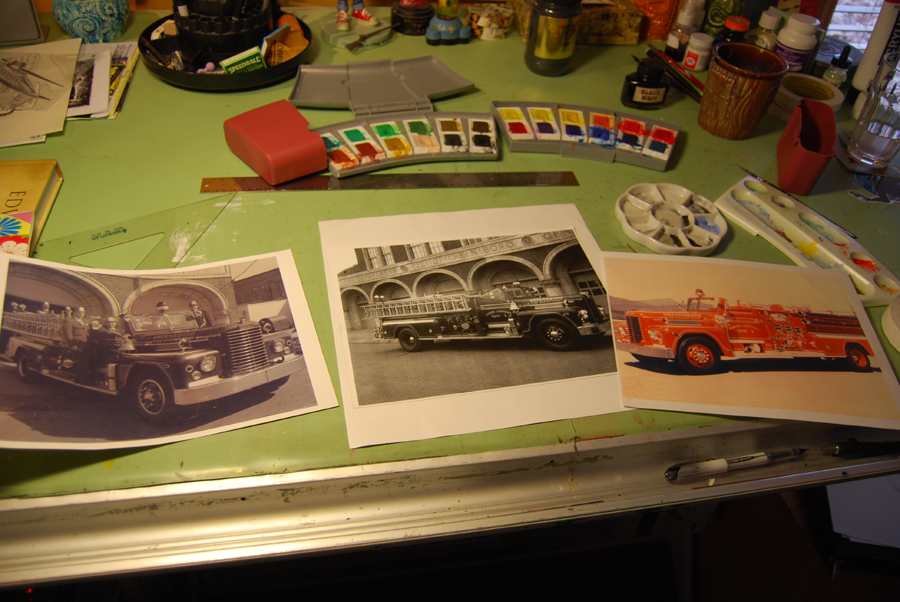 I love the shot of all the folks from the 50s on the truck but, that’s from before his time. My second favorite is the shot in front of the old station. The trick would be to find some reference of the truck in color from that side. It’s an Oren “Fire Apparatus” from 1955. Here’s an article about it. Anyway, I didn’t have any luck there. Seems that everybody loves the driver’s side. I like the passenger side with the ladders. Most of the elements exist on both sides though, so I can use the color shot for reference.
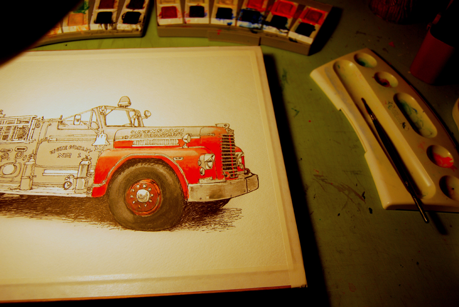
So, I started with a pencil sketch and then inked the lines with a small Sakura Microperm 01 (that way, if I slipped, it’d be a small slip. I began with the lettering which was a good idea. The roughness of the way it turned out set the tone for the rest of the thing. I was beginning to like the look. Next, I did a light grey wash to get the tones right before adding the bright reds. I screwed up, looking at the old black and white photo and made the hub of the front wheel pretty dark. Red shows up almost black in black and white.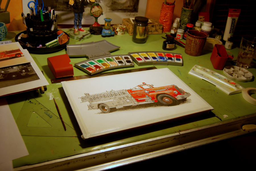
Ash you can see, I worked my way from the front of the truck to the back, adding fields of color over and over again. It takes many applications to each field to get a good, rich red while still keeping a nice gradation to the color. I’d push ahead towards the rear and then go back and add a little more pigment to a field I’d already colored. I was finding myself having a lot of fun. One of the upsides of doing a watercolor of a vehicle is that the thing is made up of little compartments, so you could move from one to the other.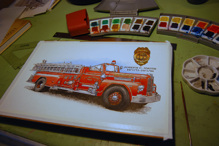
After adding all the color to the truck that I felt it needed, I threw in some blue behind it to complement the reds. I showed my progress to Barbara and she felt that the addition of a badge and his name would really make it. Inside I shook a little for fear that I’d spill ink or something else catastrophic while adding the badge and doing the lettering. I got a shot of the badge from Barbara and typed the text in Photoshop. Laid it all out at the correct size and printed it out of an 8.5X11 page. I then used my light table to trace the badge and letter onto the artwork.
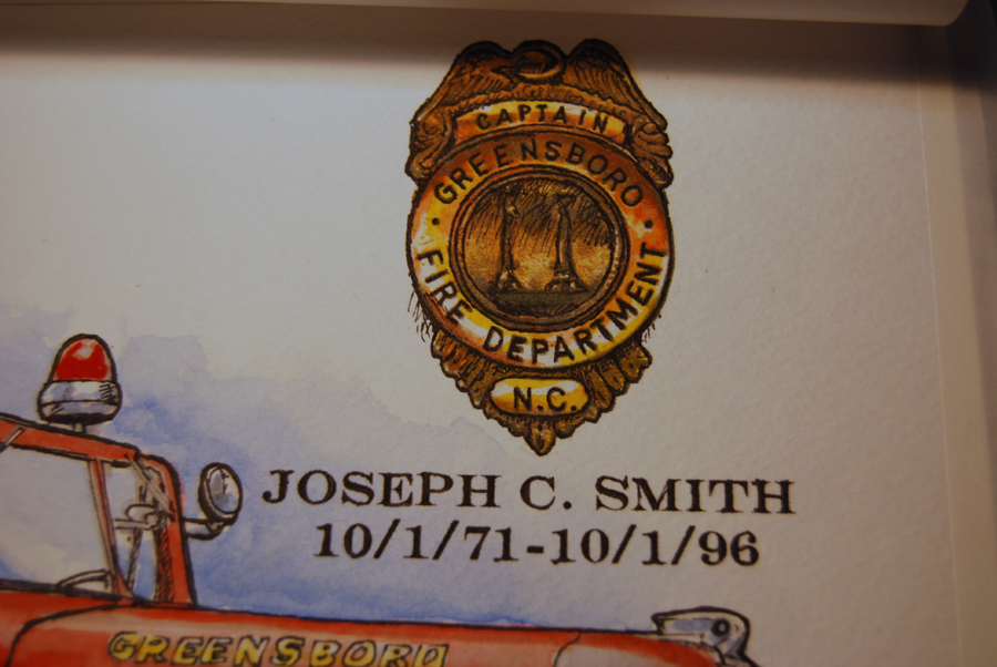 It all worked out. I went back and darkened some of the line work with more in and then sealed the whole thing with Crystal Clear. Finis!
Here’s another shot to dive you an idea of the rough style of the line work: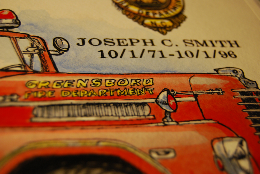


Why all the fear? if you f..uck up just hit UNDO!:-)
Hahaha! Yeah. Hit “undo” then, grab another piece of paper and start the trudge again!
Very cool!
Thanks Laurie!